Chart Rendering Improvements
Published on Feb 28, 2022 by Jared Rada · 4 min read
Over the last few months we've massively upgraded the charts on SeaDrive. This includes both internal processing improvements and user side visualization improvements. The net result for SeaDrive users is far more accurate charts, more up-to-date charts, and better iconography. As a heads up to readers, some of this blog post goes into some high level technical.
Firstly, on the internal processing side we've built tooling that completely automates the chart production process. As background, our chart data is derived from NOAA ENC (Electronic Navigation Charts) products. Our new process will automatically fetch the NOAA chart data, run the processing task, and upload the result to our cloud provider (AWS), which in turn is streamed back to SeaDrive users. This means with just one command we can run the entire sequence fro start to finish- or better invoke the process at a scheduled frequency. This means as NOAA releases data updates to the ENC files our users will see the updates in a timely fashion.
I'd also like to point improvements to certain feature types (including anchorage areas) that used to "randomly" show lines slicing through the feature. This happened quite frequently in the old version of SeaDrive. The root cause was the fact that the feature existed in more than one ENC chart file. To handle this scenario, NOAA would encode the feature in each necessary chart file, and a border would appear on the border of each file encoding the data. In the example anchorage area below, the feature exists in four different chart files!
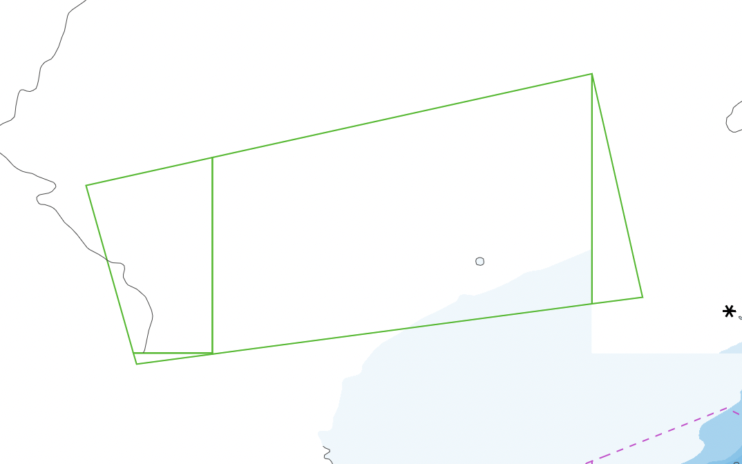
To handle this scenario and make the green anchorage boundary appear a little more consistent we did a bit of geospatial processing. Roughly we are doing the following:
- Detect if the feature intersects the boundary of the ENC file in question.
- If so, convert the polygon feature in a line feature.
- Remove the segment of the line that intersects the boundary of the ENC file.
- Duplicate the feature into a polygon and utilize this duplicate for "fill" detection (used in the SeaDrive info panel).
Once the feature is handled, the result is a more normal looking rendering.
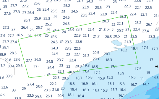
The solution isn't perfect, has some drawbacks, and can't be applied in all cases, but for a majority of cases, this technology will improve the chart look and feel. You may have noticed another difference the after image. We've been able to reveal more chart detail at lower zoom levels. As you zoom into a SeaDrive chart you'll notice more detail appears sooner than before. This improves safety of the application since more critical features will be surfaced sooner as a user zooms in further.
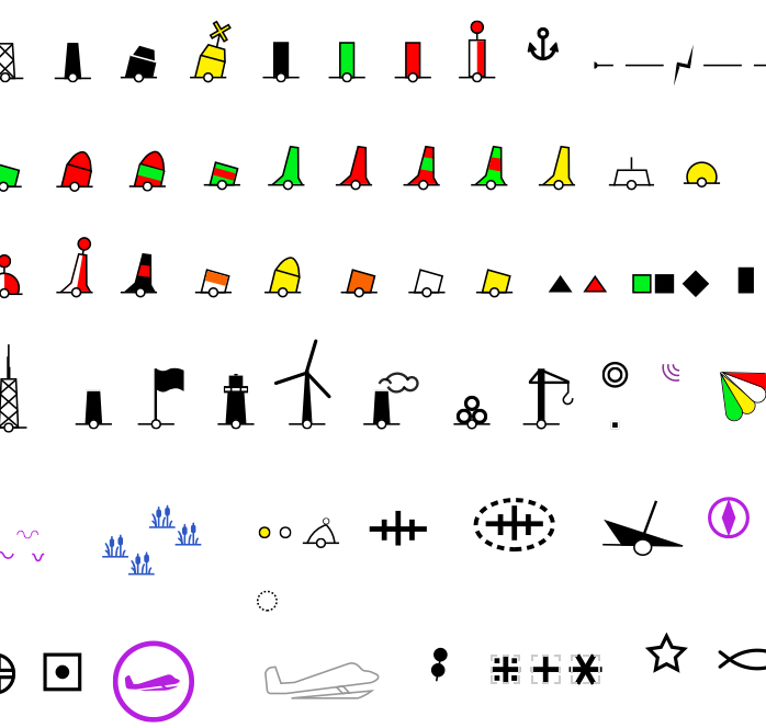
In addition to this we also revamped our iconography. You'll notice far more accurate iconography that more closely
matches the real life object. We spent quite a bit of time improving the styling and usability of these small images. We
know being on water, often in direct sunlight, with heat, sunscreen and the like can often make legibility difficult. We
hope these icons make it easier on SeaDrive uers.
Another improvement we've made is the ability to automatically deliver chart style updates. After we automated our tile making process, we felt we should also automate our chart styling process. When a SeaDrive developer updates the styles in Mapbox Studio (the software we leverage for styling and rendering) he can now also trigger an update process for our mobile app (and web) users. All the client apps will receive the update the next time the app in launched. This means we no longer need to wait for regular version releases in order to update the styling. This will improve the feedback loop for styling since this is an area we frequently iterate. It also makes the developers lives significantly easier! Prior to these changes we used to manually copy (very large) style definitions all around our app, and used to manually splice our SeaDrives styles with default Mapbox styles. This was painful and error prone- but no more! Automation is a popular topic in software development, and we've adopted that mentality wholly.